Design System
Year
2025
Software
React / Storybook
Responsibilities
Product Design
UI Kit / Design System
Documentation
Front-end Development
Overview
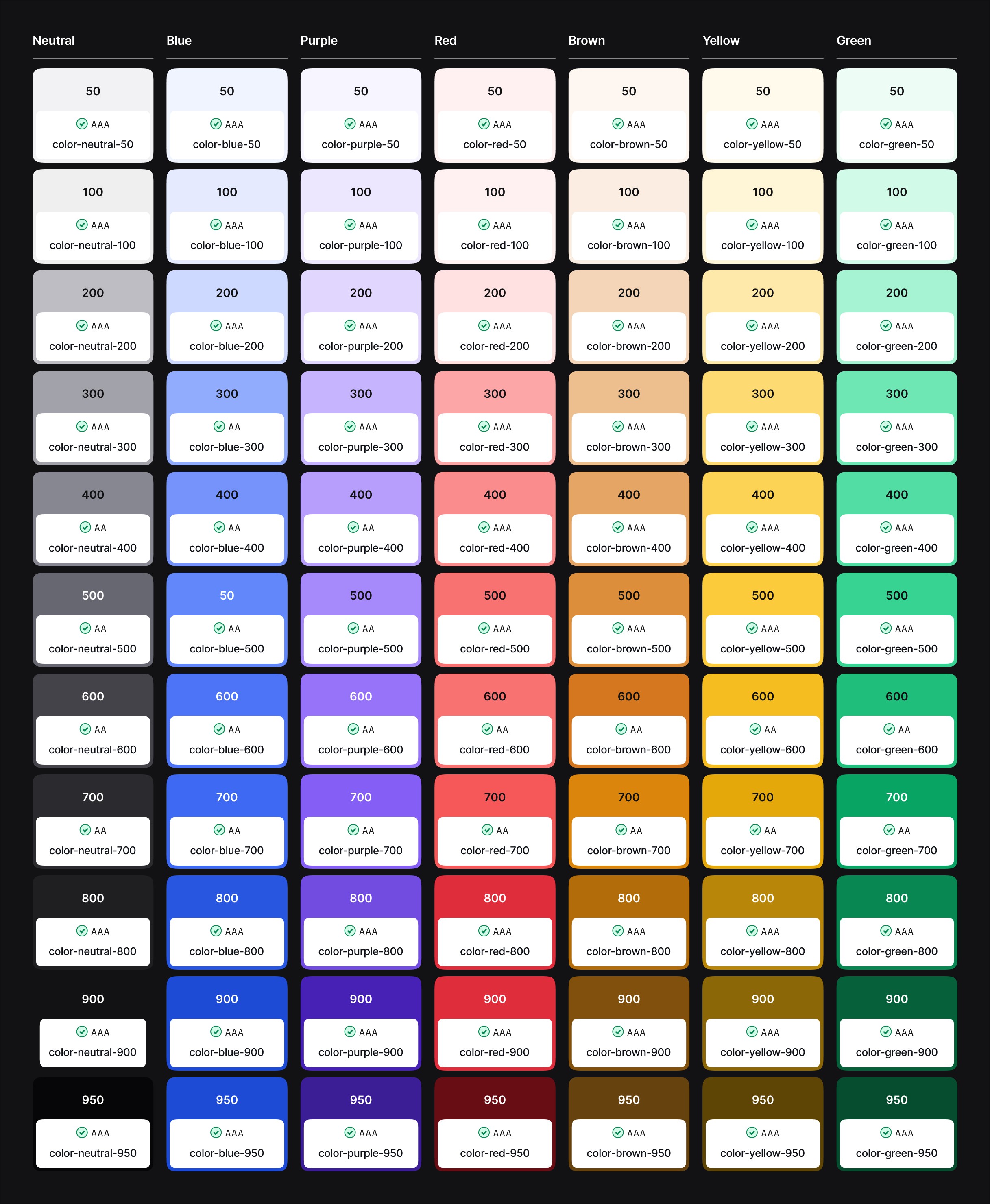
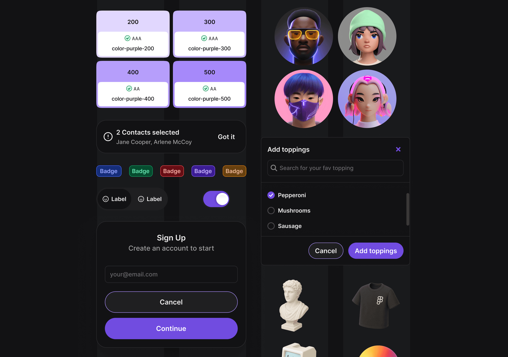
A scalable design system created to bridge the gap between design and engineering. By tightly coupling Figma Variables with React components, the system delivers token parity across design and code. Colours, spacing, and typography inherit seamlessly, making brand theming and UI evolution fast, reliable, and consistent across platforms.
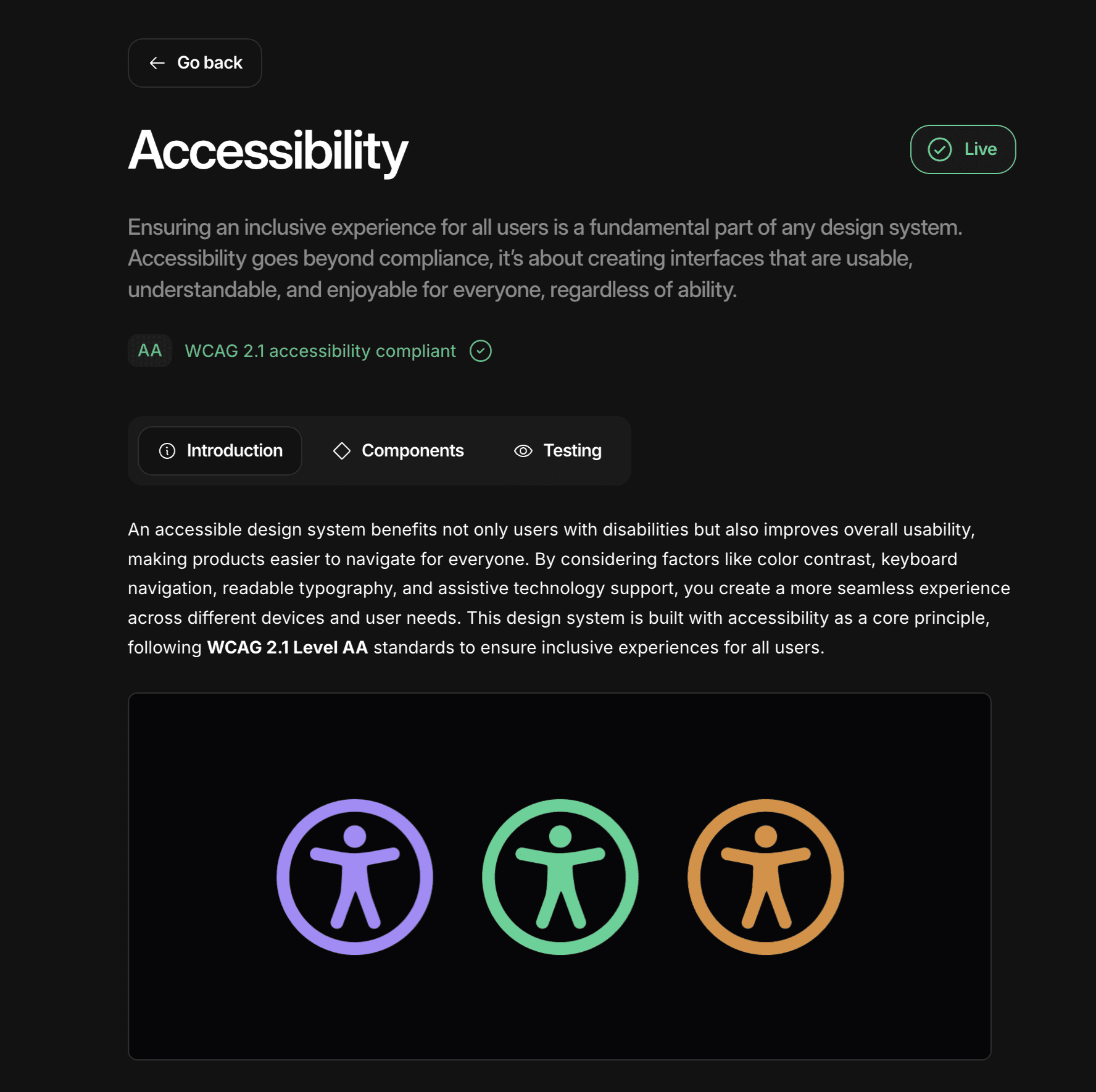
Accessibility
The system includes all core components in light and dark modes, engineered with WCAG 2.1 AA compliance and tested against industry tools like axe-core, WAVE, NVDA, JAWS and VoiceOver. Accessibility isn’t a layer on top, it’s built into the foundation.
Storybook
Every component is documented in Storybook, with props named and structured to mirror React conventions. Related props are clearly surfaced, so designers and engineers share the same vocabulary and context. This alignment removes ambiguity, speeds up handoff, and keeps teams shipping fast without friction.